Reports
Reports gives you a historical view of your finances — monthly summaries, spending breakdowns, 6-month trends, budget performance, debt payoff progress, and savings contributions, all in one scrollable screen.
Reports — Monthly Summary and Health Score
calendar_month Calendar vs. Income Cycle Mode
A toggle at the top of the screen switches between two views:
- Calendar — data for the standard calendar month (1st to last day). Good for comparing the same month across different years.
- Income Cycle — data aligned to your pay date (e.g. 25 May – 24 Jun). This matches how financial capacity is calculated and gives a more accurate picture of a single pay cycle.
Use the arrow buttons beside the month label to navigate to previous periods. Income Cycle mode is only available if your income start day is not the 1st of the month.
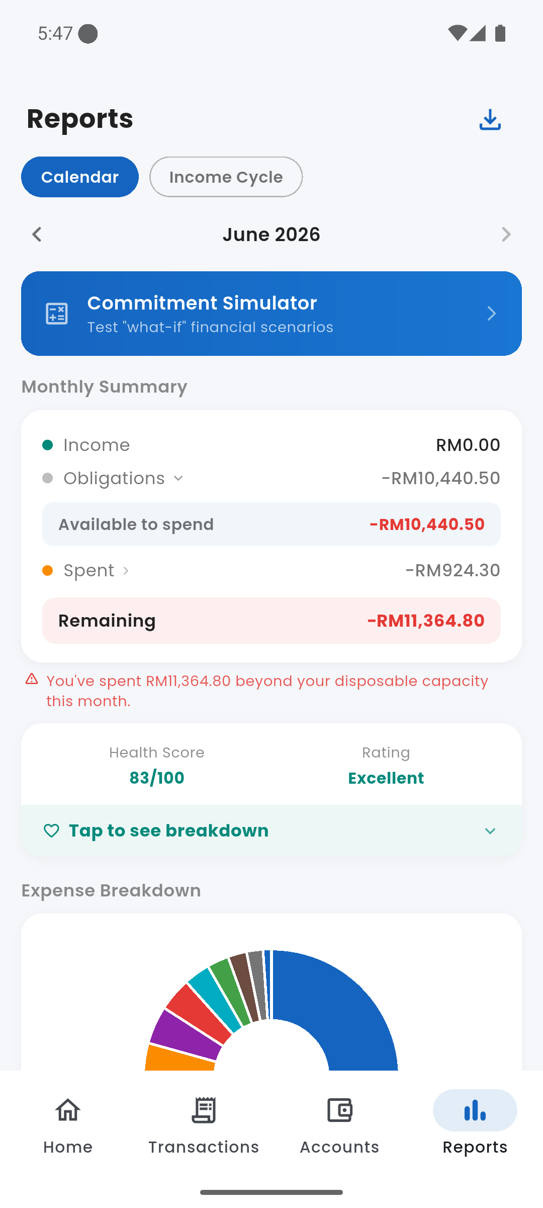
bar_chart Monthly Summary
The same breakdown shown in the Monthly Breakdown card on the dashboard, scoped to the selected period:
- Income — total income recorded in the period
- Obligations — commitments + debts + savings goals. Tap to expand and see the individual components.
- Available to spend — income minus obligations (your disposable capacity for the period)
- Spent — discretionary expenses logged in the period
- Remaining — available minus spent. Goes red if you overspent your capacity.
health_and_safety Financial Health Score
Your Health Score and rating label (Excellent / Good / Fair / Needs Attention) for the selected period. Tap "Tap to see breakdown" to expand the three components that make up the score: Commitment Ratio, Debt Service Ratio, and Savings Rate.
donut_large Expense Breakdown
A donut chart showing how spending was distributed across categories for the selected period. Tap any segment or its legend row to highlight it and see the exact amount and share. Categories are listed below the chart sorted by spend, each with a colour dot, amount, and percentage.
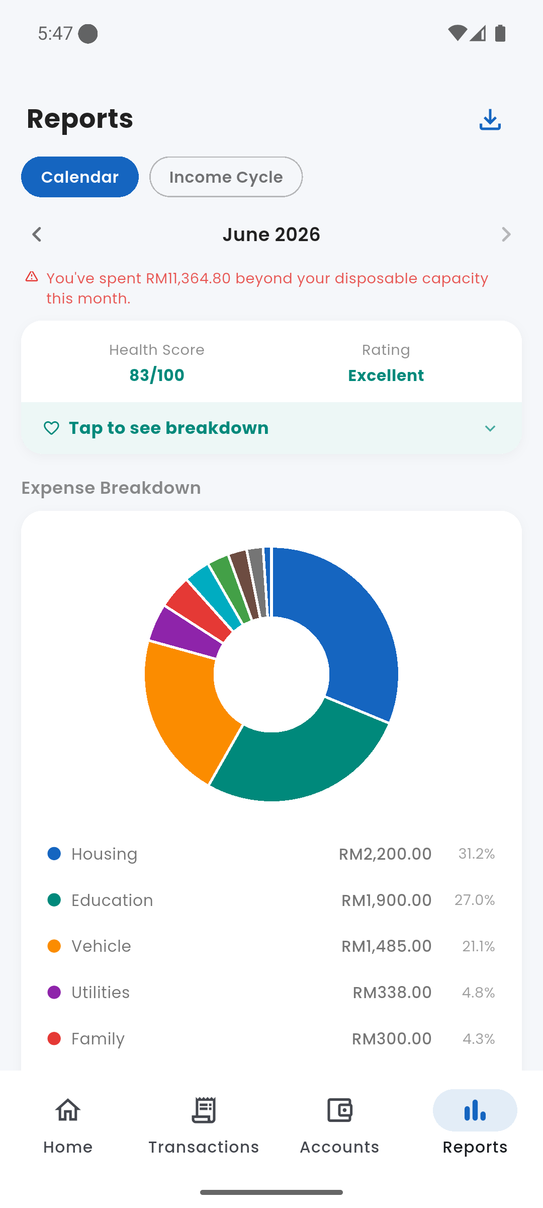
Expense Breakdown — spending by category with percentages
trending_up 6-Month Trend
A grouped bar chart showing Income (teal) vs Expenses (red) for each of the last six months side by side. Tap a bar group to reveal the exact income, expense, and net figures for that month inline below the chart.
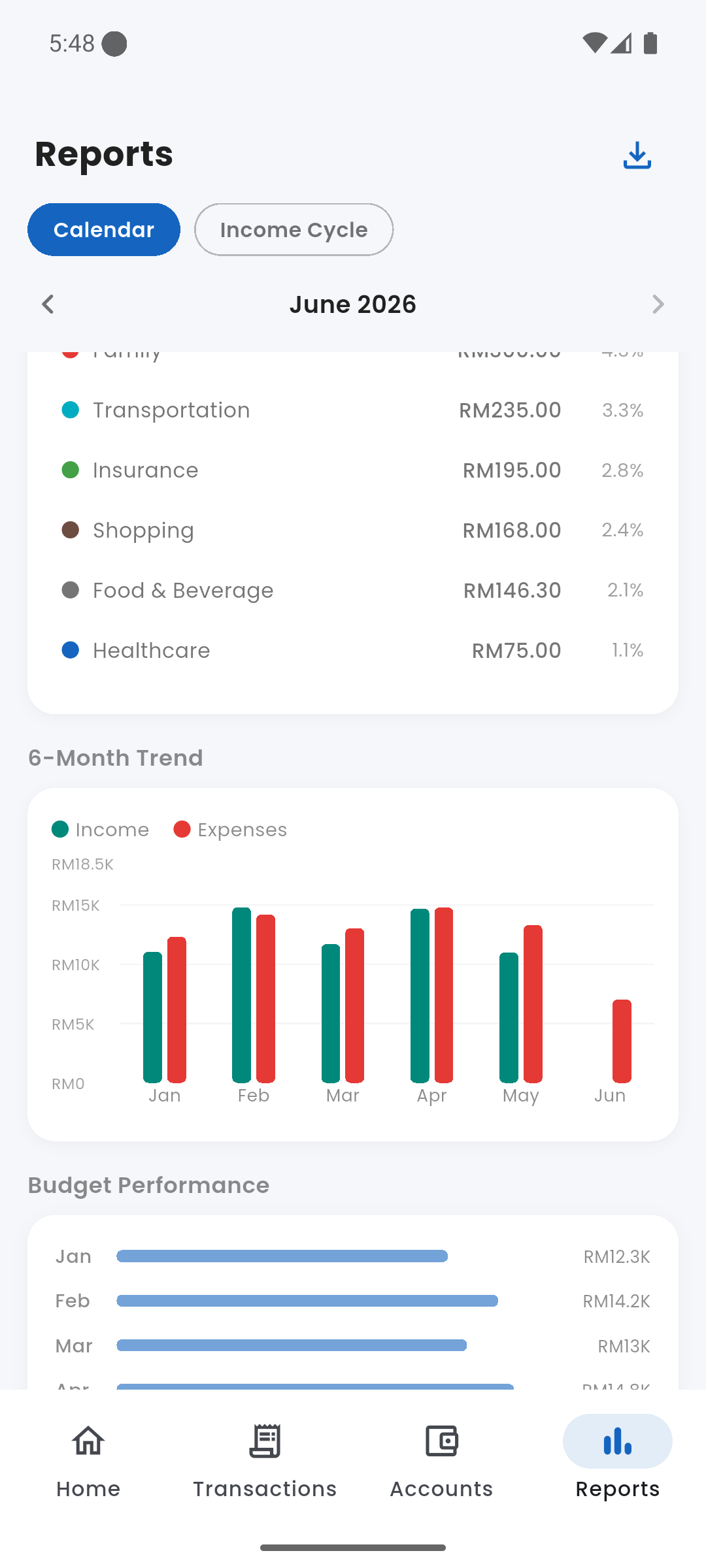
6-Month Trend — income vs expenses Jan–Jun, with Budget Performance below
rule Budget Performance
A horizontal bar chart with one row per month (last six months). Each bar shows total spending against total budget for that month — bars turn red in months where spending exceeded the budget limit. A summary line at the bottom shows how many months out of six were within budget, with a link to the Budgets screen.
credit_card Debt Payoff Forecast
Only shown when you have active debts. Each debt displays:
- Debt name and outstanding balance
- A progress bar showing percentage paid so far
- Estimated months remaining at the current instalment rate
- Projected payoff date (e.g. ~43 months · Jan 2030)
Tap Manage debts to go to the Debts screen.
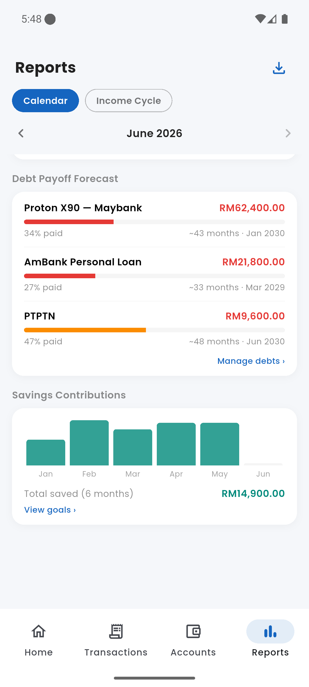
Debt Payoff Forecast per debt, and Savings Contributions chart
savings Savings Contributions
Only shown when savings contributions exist. A bar chart showing how much was added to savings goals each month over the last six months. The total saved across the 6-month window is shown at the bottom, with a View goals link to the Savings Goals screen.
calculate Simulator Shortcut
A banner near the top of the Reports screen links directly to the Simulator — a quick way to jump from reviewing your current financial state to modelling what-if scenarios.
download Exporting Data
Tap the download icon (top-right corner) to export the current period as a CSV file. The export includes a summary section and a full individual transaction list with date, type, category, subcategory, description, and amount. The file can be opened in any spreadsheet app or saved to Files.