Dashboard
The dashboard is your financial command centre — a scrollable collection of cards covering your income cycle, obligations, health score, ratios, and account balances. Cards can be reordered and toggled to suit your preference.
Dashboard — top section
apps Quick Links
Four icon shortcut tiles sit just below the dashboard header, always visible. They take you directly to the four feature screens that aren't on the bottom navigation bar: Budgets, Savings Goals, Simulator, and Lent Money. Individual tiles can be hidden from the dashboard customize sheet.
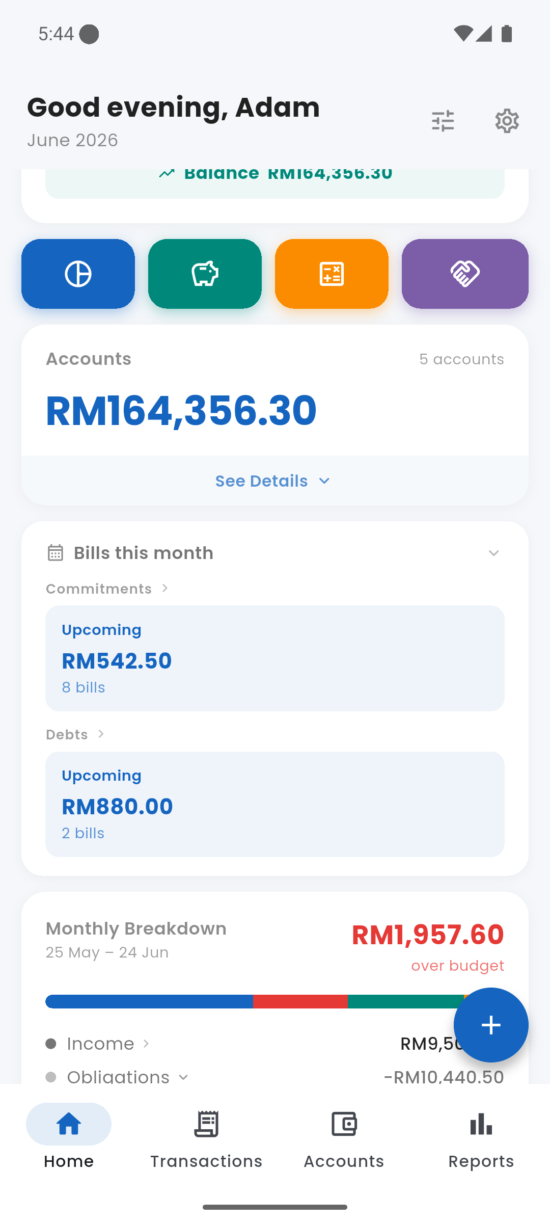
account_balance_wallet Accounts
The Accounts card shows your combined balance across all accounts and how many accounts you have. Tap See Details to expand and see each account name and its individual balance. Tap any account row to go to that account's detail and transaction history.
Accounts card — collapsed and expanded
event Bills This Month
The Bills card shows all unpaid obligations for the current month in two groups: Commitments (fixed subscriptions, rent, instalments) and Debts (loan payments due). Each group shows the total amount and number of bills outstanding.
Tap either group label to go to the relevant screen and mark items paid. When all bills are settled the card shows an "All clear" state. If an obligation is overdue it appears in a red section; upcoming bills appear in blue.
Bills this month — commitments and debts grouped
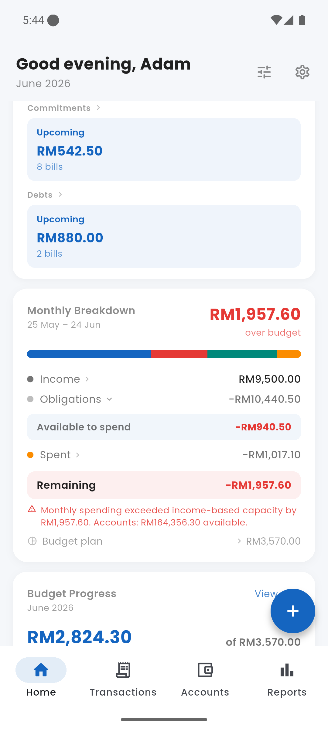
bar_chart Monthly Breakdown
The Monthly Breakdown card is the core of how Expenses models your finances. It shows exactly where your income goes across the current income cycle (shown as a date range, e.g. 25 May – 24 Jun).
The stacked bar at the top visualises your income split across obligations, spending, and remaining capacity. Below it, the card breaks down:
- Income — your total recorded income for the cycle. Tap to see income by source.
- Obligations — total of commitments + debts + savings goals combined. Tap the row to expand and see each component (Commitments, Debt, Savings) with links to their screens.
- Available to spend — Income minus Obligations. This is your true disposable capacity for the cycle.
- Spent — discretionary expenses logged so far. Tap to view all transactions.
- Remaining — Available to spend minus Spent. Goes red if you have overspent.
- Budget plan — the total of all budget limits you have set. Shown for reference; not deducted from capacity.
Financial capacity is income-based — it resets cleanly each cycle regardless of your account balance. Your account balance (carry-forward savings) is shown separately in the Accounts card.
Monthly Breakdown — income, obligations, and remaining capacity
pie_chart Budget Progress
Shows your total discretionary spending against the sum of all budgets you have set for the month. A progress bar fills as you spend — turning amber at 80% and red when over. The card also shows the total remaining amount and flags how many categories are over their individual limit.
Tap View all to go to the full Budgets screen and see a breakdown per category.
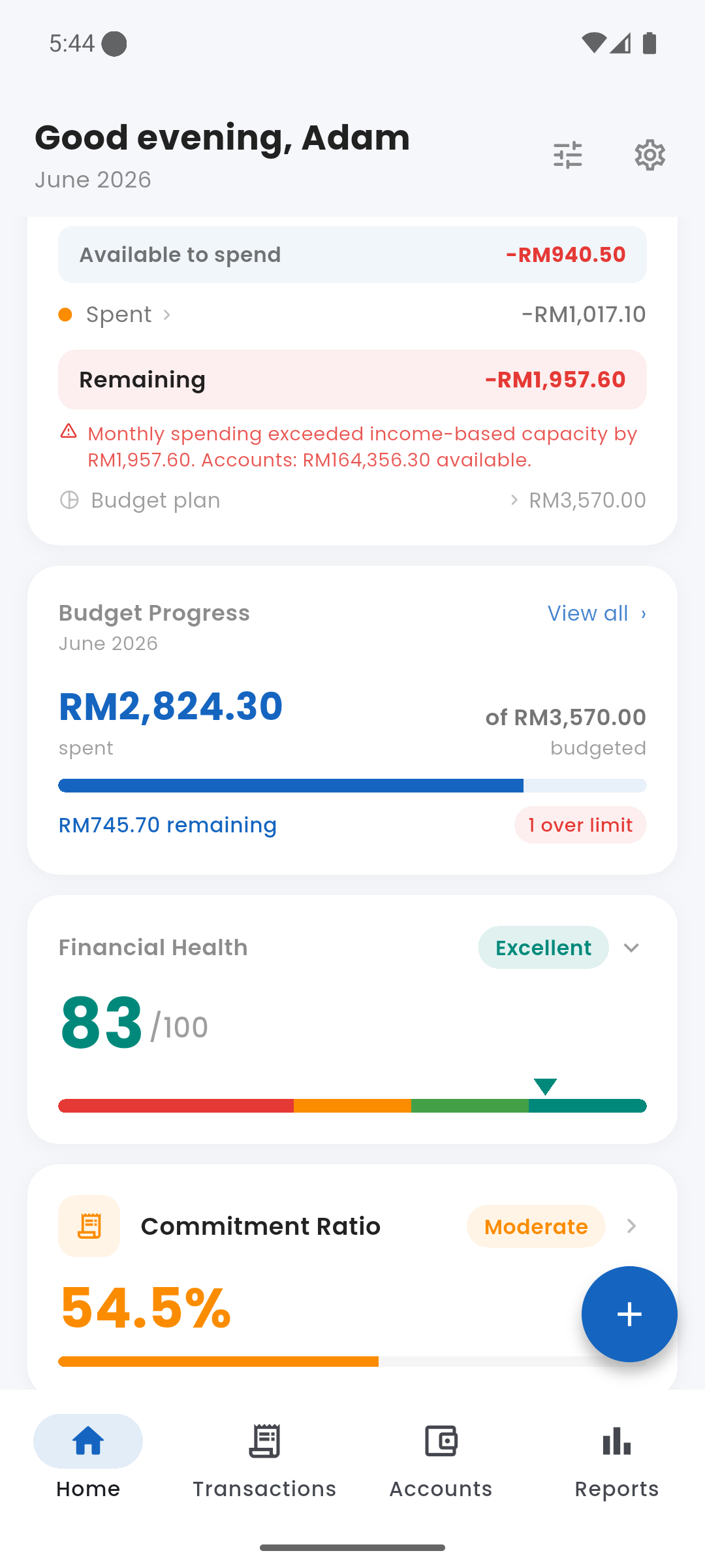
Budget Progress — total spent vs. budgeted
health_and_safety Financial Health Score
A 0–100 score that gives you a single number for your overall financial health. The score is colour-coded and labelled:
- 80–100 — Excellent (green)
- 60–79 — Good (teal)
- 40–59 — Fair (amber)
- 0–39 — Needs Attention (red)
Tap the card to expand and see the three components that make up the score: Commitment Ratio, Debt Service Ratio, and Savings Rate. A low score in any one component pulls the overall score down and tells you exactly where to focus.
Financial Health Score — 83/100 Excellent, with ratio cards below
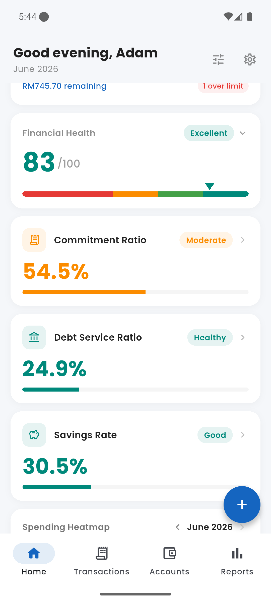
event_repeat Commitment Ratio
Shows what percentage of your income is consumed by fixed commitments (rent, subscriptions, loan instalments). A high commitment ratio means less flexibility in your budget. Tap the card to view your Commitments screen.
- Below 40% — Healthy
- 40–60% — Moderate
- Above 60% — High
credit_card Debt Service Ratio
DSR = total monthly debt instalments ÷ gross monthly income. Banks use this to assess borrowing capacity; Expenses tracks it so you always know where you stand. Tap to go to your Debts screen.
- Below 30% — Healthy
- 30–40% — Moderate
- Above 60% — High (financial stress zone)
savings Savings Rate
Savings Rate = total savings goal contributions ÷ gross monthly income. Shows what share of your income you are actively saving each cycle. Tap to view your Savings Goals.
- Above 20% — Good
- 10–20% — Fair
- Below 10% — Low
grid_on Spending Heatmap
A calendar-style heatmap showing spending intensity by day. Cells shade from light to deep orange-red as daily spending increases — a quick visual scan reveals your heaviest spending days. Navigate to previous months using the arrows at the top.
Tap any day to jump straight to the transaction list filtered to that date.
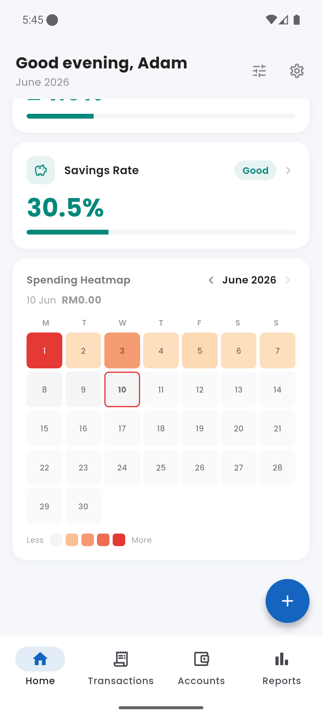
Spending Heatmap — June 2026
swap_vert Cash Flow
The Cash Flow card gives a complete money-in / money-out summary for the current cycle: Opening Balance → Income → Expenses → Closing Balance. It answers the question "where did my account balance come from?" — showing not just what you earned and spent but what you carried forward from the previous cycle.
Tap the Income row to expand and see a breakdown by income source. Tap the Expenses row to see a per-category breakdown of where money went. This card can be shown or hidden from the dashboard customize sheet.
account_balance Net Worth
Net Worth = total account balances + outstanding lent money − total outstanding debt. Updated in real time whenever you log a transaction, record a debt payment, or receive a loan repayment. A single number that shows whether you are building or eroding wealth. This card can be shown or hidden from the customize sheet.
tune Customizing the Dashboard
Tap the filter icon (top-right of the dashboard header) to open the customize sheet. From there you can toggle each card on or off and drag to reorder them. Your arrangement is saved and persists across sessions.